
Project 3 of 7: Web product · Homepage redesign
Emirates Airlines
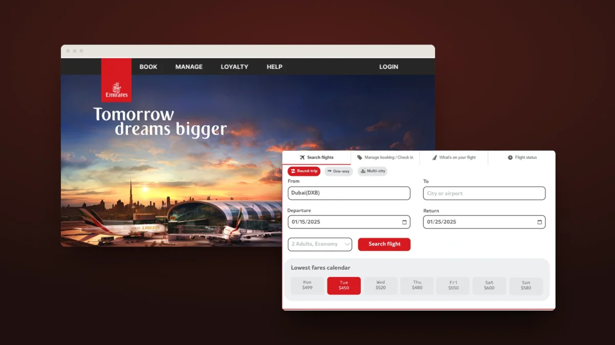
A design task: a calmer Emirates homepage, built around a simpler flight search and a fare calendar.
- Type
- Web product
- Category
- Homepage redesign
- Platforms
- Web
Overview
A design task on the Emirates Airlines homepage — the website behind 80% of the airline’s direct bookings. Over five stages — empathize, define, ideate, prototype and test — the redesign streamlines the flight search and simplifies the header around booking and login.
The problem
The brief: the homepage has a 10% bounce rate and 40% flight-search abandonment, driven by a cluttered header and a complex search widget. Users struggle with manual inputs, overlook ancillary services, and rarely log in before booking — directly affecting conversion and revenue.
The goal: reduce the homepage bounce rate by 35% and increase engagement with ancillary services by 300%, through a streamlined flight search widget and a simplified sticky header that puts core actions like login and booking first.
Research
We interviewed 6 potential users by phone about the challenges they faced while booking: searching for flights, using the search tool, choosing dates and passengers, and adding extras like travel insurance.
- Users frequently made errors when typing airport codes by hand.
- Without a price calendar, users wasted time checking dates one by one for an affordable fare.
- Critical features like “Multi-City” trips were often missed, because they were hard to see in the search widget.
- Ancillary services like travel insurance were overlooked, because they appeared too late in the booking process.
- The cluttered header distracted users from core actions like searching for flights and logging in.
Competitors
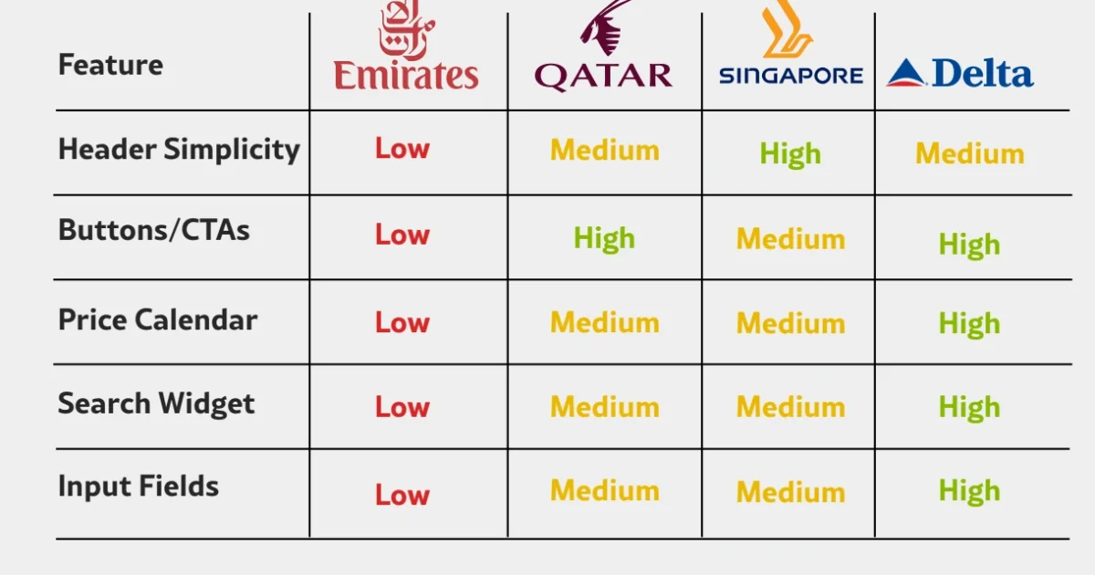
The Emirates homepage rated against Qatar Airways, Singapore Airlines and Delta on header simplicity, buttons and calls to action, the price calendar, the search widget and input fields. Emirates rated low on all five; Delta rated high on four.
Who it is for
Kamal Diab
34 · Lead electrical engineer · Dubai, UAE
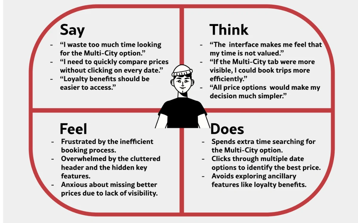
Married, living in Dubai. What he needs: the “Multi-City” tab made prominent in the search widget, and prices for all dates shown upfront.
Goals
- Book multi-city trips quickly
- Access loyalty benefits
- Find and book the fastest flights quickly
- Compare prices for flexible dates
Frustrations
- “The ‘Multi-City’ option is buried — I waste time searching for it.”
- “No price calendar — I have to click 10 dates to find the cheapest one.”
Key decisions
Multi-city in plain sight
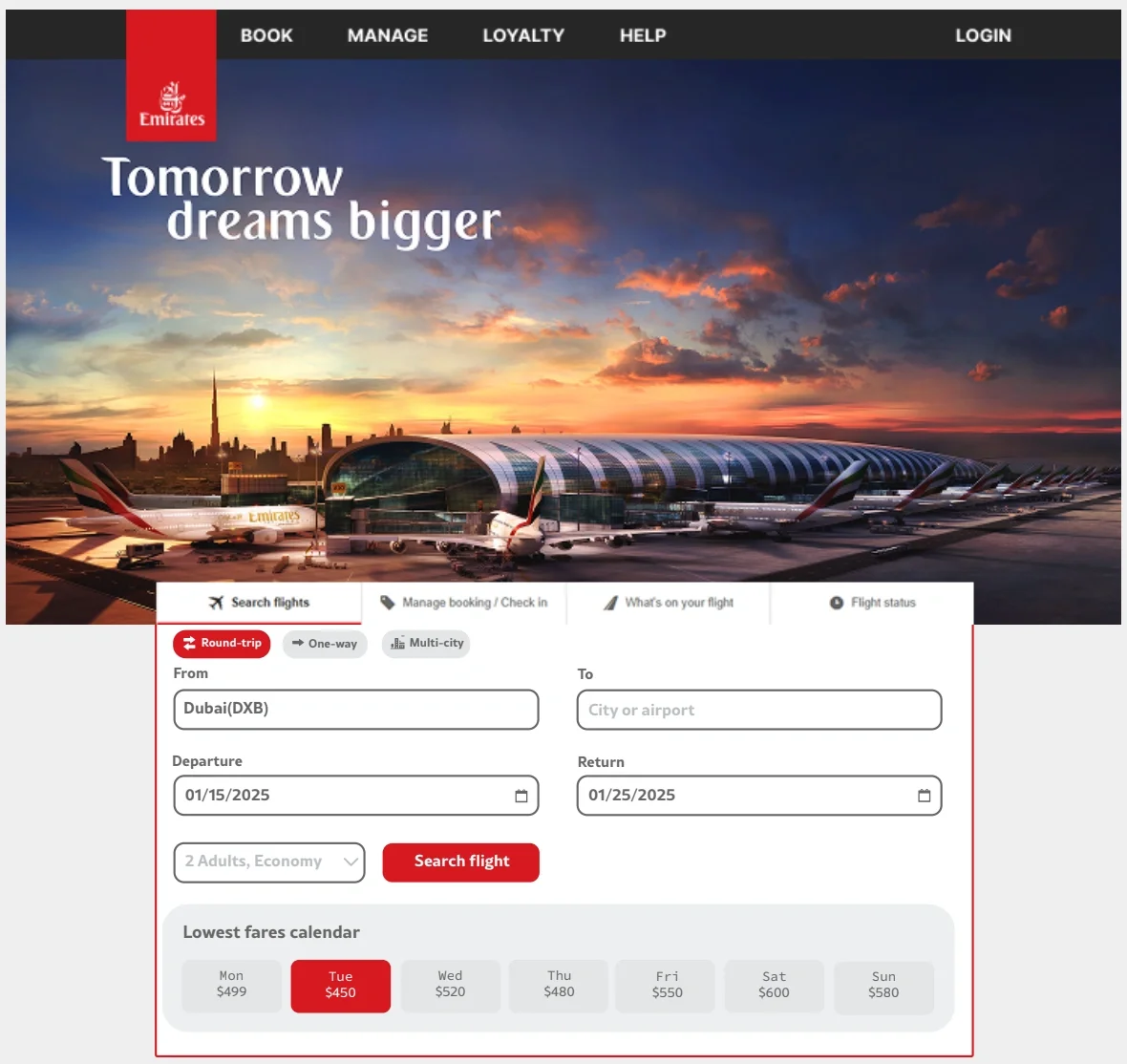
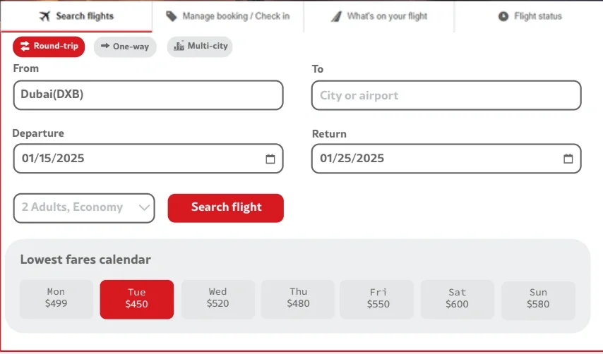
Interviewees often missed the Multi-City option. The new search widget gives round-trip, one-way and multi-city equal tabs, right at the top.
Prices before dates
With no price calendar, people clicked through dates one by one. A lowest-fares calendar now shows a price for every day.
A header that gets out of the way
The cluttered header pulled attention away from searching and logging in. The new header is simplified and sticky, down to Book, Manage, Loyalty, Help and Login.
Final design
The redesigned homepage, with the new flight search brought up under the hero.
Conclusion
The redesigned homepage and flight search widget address the main pain points from the research with more simplicity, usability and transparency. With clearer navigation and better visibility of ancillary services, the new design aims for a smoother, more efficient booking experience.