
Project 1 of 7: App design · Mobile app
Artigo App
A museum companion that helps visitors find the exhibits that matter to them and plan a route that fits their time.
- Type
- App design
- Category
- Mobile app
- Role
- UI/UX design
- Duration
- 3 weeks
- Team
- Team of four
- Platforms
- iOS
- Tools
- Figma, Adobe Illustrator
Overview
Artigo is an app that helps museum visitors navigate easily, discover important exhibits, and plan their visit based on their time. We worked through five stages — empathize, define, ideate, prototype and test — and designed it for iOS, where our research showed the bigger need.
The problem
Visitors at a large museum often feel lost. They miss key exhibits, or don’t understand the best route to take for their interests and time limits.
Research
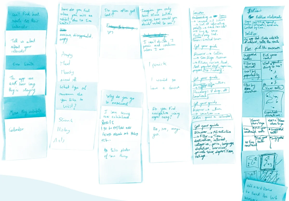
We interviewed people who visit museums often — 6 tourists and culture enthusiasts aged 18–35 — in person, to uncover their pain points around navigation, time management and finding exhibits.
- “I always forget directional signage right after seeing it. I am not a big fan of physical maps because they’re not interactive, so I think having a digital map would make my life easier.”
- “Whenever I visit large museums, I always get lost due to the time constraint and the large number of exhibits. I get drained at the end of the day.”
- “I usually panic and feel frustrated. I try to visit the most popular exhibits, but end up visiting the ones that are not interesting, because I have no idea what the best exhibits are.”
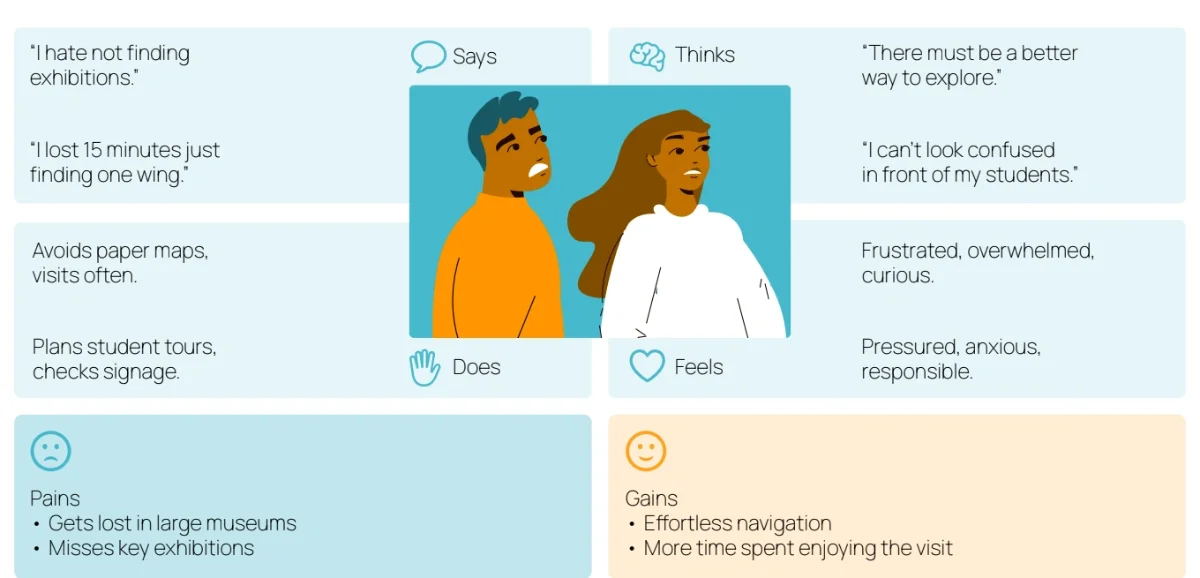
Who it is for
Rima
20 · Art student
“I hate not knowing how to find the art I’m looking for.” Loves looking for particular artworks, and always gets lost. Very comfortable with technology; visits museums 7+ times a year.
Goals
- Find particular artworks in large museums
- Avoid wasting precious time
- Navigate museums effortlessly
Frustrations
- Hates physical maps
- Fears missing the best exhibitions
- Feels drained at the end of the day
Nohad
33 · History teacher
“We had only 90 minutes to explore, and we wasted 30 of them lost.” Occasionally takes his students to several museums. Moderately comfortable with technology; visits museums 3+ times a year.
Goals
- Plan tours for his students
- Find his way around large museums
- Visit the history exhibitions at each museum
Frustrations
- Looking lost in front of his students
- Fear of being late for his responsibilities
- Hates wasting time
Competitors
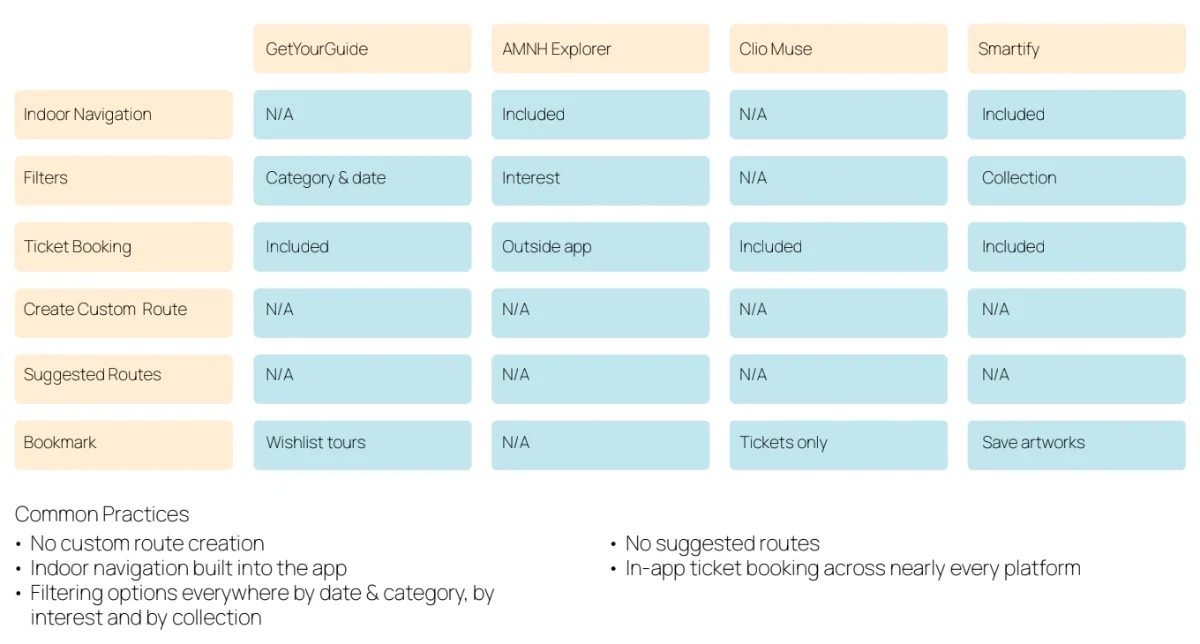
We reviewed four apps — GetYourGuide, AMNH Explorer, Clio Muse and Smartify — and how their UI/UX handles the challenges Artigo is designed to solve. What they have in common:
- No custom route creation.
- No suggested routes.
- Indoor navigation built into the app.
- Filters everywhere: by date and category, by interest, by collection.
- In-app ticket booking on nearly every platform.
Key decisions
Two ways to plan a visit
None of the apps we reviewed offered custom or suggested routes. Artigo offers both: follow a route suggested by the museum, or create your own from the wings and artworks you want to see.
Routes sized to the time you have
Suggested routes filter by your interests and your time — by popularity, short or long — and every route shows how long it takes to explore.
iOS first
We designed the app for iOS, based on our user research showing a bigger need for it, and hope to expand to Android in the future.
Sitemap
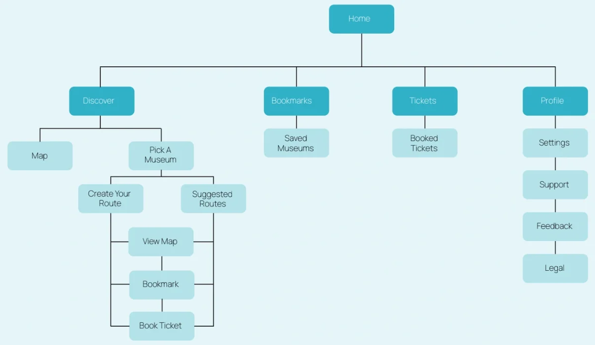
Four tabs: Discover, Bookmarks, Tickets and Profile. Discover holds the map and the museums; inside a museum, you create your own route or pick a suggested one, then view it on the map, bookmark it or book a ticket.
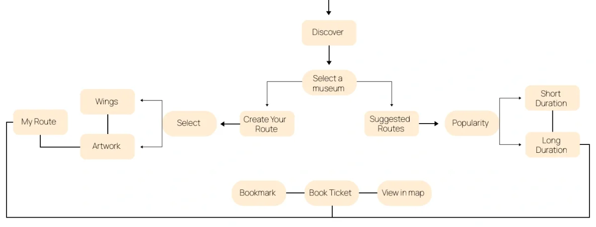
User flow
From discovering a museum to a finished plan, by either path.
- Discover
- Select a museum
- Create your route, or pick a suggested one
- Bookmark, book a ticket or view it on the map
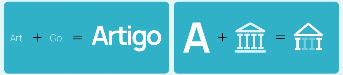
Name and mark
Art + Go = Artigo. The mark joins the letter A and a museum icon.
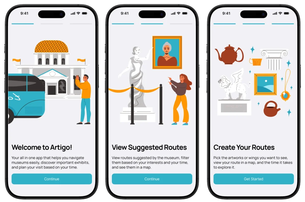
Final design
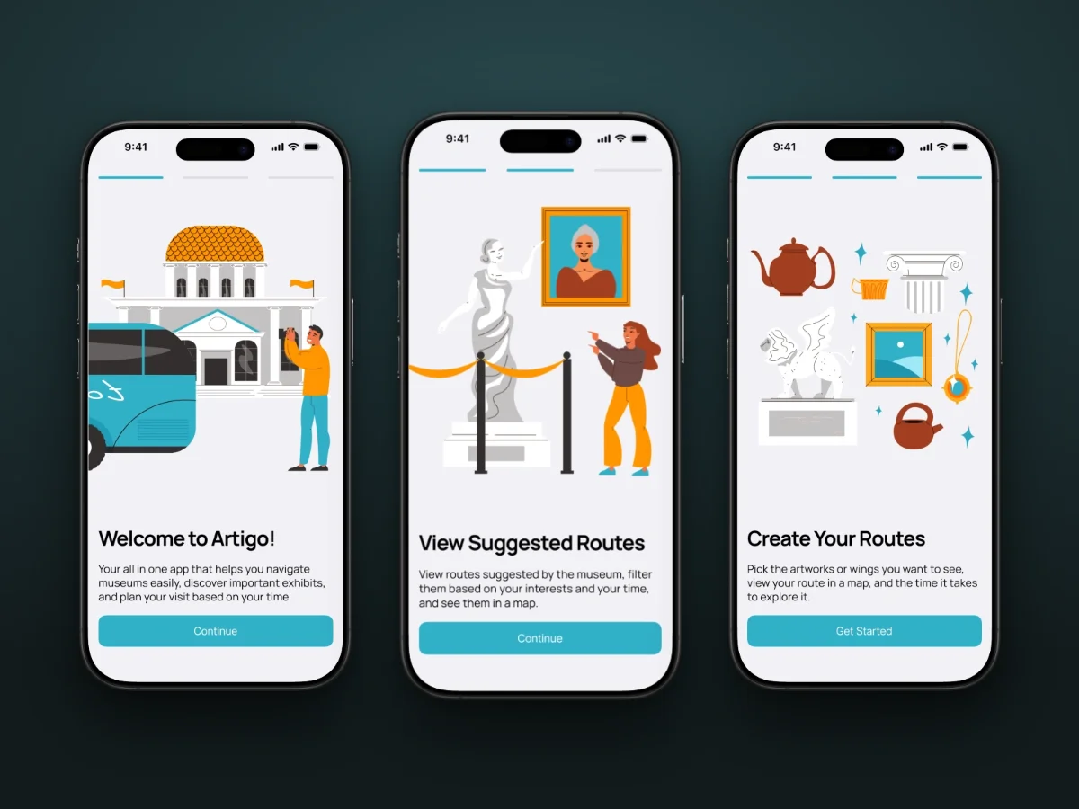
Onboarding introduces what Artigo does: welcome, suggested routes, and creating your own.
Open the prototype (opens in a new tab)
Usability testing
- found the app intuitive and easy to navigate
- 92%
- said the custom tour feature helped them feel more in control of their visit
- 85%
Multiple rounds of testing, remote and in person, with an interactive prototype and participants close to our audience: tourists, casual museum-goers and time-conscious visitors. Each one was asked to:
- find a specific exhibit based on personal interest
- create a quick tour for a 30-minute visit
- navigate from their current location to a desired exhibit
The route guidance feature would eliminate the frustration I typically feel when navigating large museums.